Pages

Friday, March 30, 2012

Offices: The Bolder, The Better!

I don't know about you, but when it comes to creating an office space, I am a huge fan of boldness.  Give me bright colors, busy wallpaper, and interesting accent furniture and I'm a happy girl.  My husband, on the other hand, does not share my sentiments for wild decor, so it looks as though I am going to have to live out my bold office inspiration on All Things Luxurious this morning, and not in our apartment.  ;-)

I love how this office has two separate workspaces up against the same wall -- seemingly one for a male, and one for a female (judging on the color of the chairs!).  I also really appreciate the two separate lighting options for this space -- it really gives them room some nice visual interest.  And the colors?  Of course I'm in love!  ;-)

This is a nice bohemian-inspired space.  I love that the desk area is flanked by two floor-to-ceiling bookshelves, and the pop of the lime green workspace is really bright and peppy.  All of the furniture is a little mis-matchy, but the flow is fantastic -- the space definitely feels planned out and well done.

Okay, I really like that stenciled accent flowery accent wall.  Very fun.  Two workstations again -- a nice luxury in an office; this looks to be part office, part craft room, which I really like!  This is sort of what I hope for my husband and I to have at some point -- two areas for us both to work on different things.  (Probably without the flowery wall, though.  I'll have to work on that.)

In this office, I really like how the accessories are the accents.  The room itself is all white, but with the addition of the boxes, chairs, and window treatments, this space become bold and colorful.  Plus, polka dot chairs are my friend.  ;-)

This space is fabulous.  Look at that rich, luxurious burnt-orange of the shelving in the background!  And the zebra-print throw rug underneath the modern-glam black desk is perfection.  I also love the teal lamps mixed with the stripes of teal on the chair cushions.  

An office with bright pink walls.  What more could a girl want?  This office is also a fabulous example of how a Persian rug can totally work in a modern space.  It's definitely one of my favorite decorating inspirations, and it works perfectly in this room.

Bold and daring, a chevron rug is one of the coolest accessories you can add to any room, and they are super trendy right now.  I really like this space -- and that desk is absolutely gorgeous!

This is a fabulous example of old-Hollywood glamour.  That tufted burnt-orange stool; the glossy black desk with the brass hardware; those lustrous blue walls -- doesn't this office make you think of an old hotel that you would've seen in a movie like Breakfast at Tiffany's?

Which of these offices is your favorite?

Do you like boldness when it comes to home offices?

love, maria

Thursday, March 29, 2012

Wood Flooring Round-Up!

Hey, there!  :-)

How are you all doing this morning?  I am busy doing some laundry and sort of planning my attack for the day.  There are quite a few things that need to be done around here!

Do you love wood flooring?  Personally, I am crazy about it.  I love how different color tones can really do so much for a room, and I really appreciate both polished and aged looks.  It's difficult for me to choose one spectrum over the other -- I really just love it all!  If there are wood floors, I'm in!  ;-)


What's your take on wood flooring?  Love it?  Hate it?

Which do you prefer -- light or dark?

love, maria

Sunday, March 25, 2012

Room Imitation

Hi, lovebugs!  :-)  Happy Sunday!

I hope you all are having a fabulous weekend.  Today I have quite a bit on my agenda -- grocery shopping, birthday shopping, and craft-making time.  I am in the process of making something for someone, and it is definitely taking longer than I had anticipated.  I'll post the project up here as soon as I'm finished!  ;-)

Today we are going to start a new series on the blog called Room Imitation.  I recently was introduced to Olioboard, a site where you can make mood boards for a room.  It is quite addictive, and within twenty-four hours I had already upgraded to the pro version so that I could use the budget, text, and color scheme tools.  You'll see what I mean if you visit the site.  But really, there are plenty of awesome features for the free version as well, so you should definitely check it out!  Anyway, Room Imitation will feature a room and an itemized breakdown of some of the most important aspects of the space.  It'll be fun, and I think that Sunday should be a series day, so we'll try this out and see how it feels.

Traditional Dining Room


{Click to Enlarge}


Total Cost: $2,891

love, maria

Friday, March 23, 2012

Moroccan Wedding Blankets

Good morning, friends!  :-)  And Happy Friday to you!

I hope you all are gearing up for a fabulous kick-off to the weekend.  My husband and I are spending the weekend at his parents' house so that we can dog-sit.  I am looking forward to cooking up a meal or two in that gorgeous kitchen, and getting some things crossed off my to-do list (things are piling up, and I hate that!).  I will be blogging all weekend, so you'll hear lots from me!

I first came across Moroccan Wedding Blankets while reading Design*Sponge at Home by Grace Bonney.  These blankets are so beautiful, and I just knew that I had to share some inspiring decorated spaces using these lovelies.

These shaggy, sequined blankets, known as handira, have important symbolic value to Berbers, an indigenous people of North Africa, who create them as part of their wedding ceremonies.  The bride-to-be and her family spend weeks weaving the sheep's wool blankets and hand-stitching thousands of flat-sequined "mirrors" onto them.  When finished, handiras are believed to have talismanic powers, bringing good luck to a marriage and offering protection.
        -Grace Bonney, Design*Sponge at Home


Just a little bit of history for ya.  ;-)

I love this blanket, sitting atop a bed, amidst a room full of girly frilliness.  That wallpaper is gorgeous, right?

Just look at the beautiful sequins!

This Wedding Blanket actually acts as a bath mat in a luxurious and elegant bathroom.

This Blanket serves its purpose as a rug underneath a dining room table in a room decorated with lovely modern glamour.

A shabby chic bedroom gets a touch of sparkle with the addition of the beautiful Blanket on the bed.

Twin beds obtain a touch of difference with the varying patterns on these Wedding Blankets.  Adorned with matching pillows, these spreads look perfect together without total similarity.

Sweet and sophisticated.

I love the differing patterns of the Moroccan Wedding Blanket and the animal-print bench at the foot of the bed.  So interesting.

What do you think of these Blankets?  Would you use them in your home?

love, maria

Thursday, March 22, 2012

Design Surprises

I am a huge fan of quirky design.  If there is something unexpected or surprising in a room, it instantly makes me feel more at home, and more at ease.  I don't know why -- it's just something that I love.  :-)  People who are daring with design and throw in those quirks garner a lot of respect from me -- it takes imagination and boldness to want to make a room a bit eccentric!

Check out these curvy bookshelves.  I love how the ones on the right are of the 'normal' variety, but to the left?  Those definitely have character.  The top shelves on the right are also pretty interesting with the diagonal cubbies.  Love it!  :-)

A funky monkey sits atop a mantel of sorts amongst beautiful Spring-like decor.  A cutesy little additive that instantly makes the on-looker smile.

Instead of an actual mirror above the bathroom sink, this one is drawn on with chalk.  Imagine the luxury of changing the shape of your bathroom "mirror" any time you want!  ;-)  A glass with toothbrushes and a bar of soap are also drawn onto this space -- a lovely, quirky touch.

A suitcase bookshelf wall.  Interesting, different, and imaginative -- I absolutely love this idea.  The best part about it is that these suitcases look totally vintage. I love that!  :-)

One sink with two spouts.  Just utilitarian enough to downplay the other feminine elements in this bathroom!

Carved wood on a staircase.  Possibly not the most quirky of touches, but doesn't it add such a lovely texture to such a simple space?

A bed with a cardboard base.  I think this is just the neatest idea!  And the addition of the drawers underneath provides both functional storage and a funky element to this bed frame.

A giant lamp looks both silly and utterly cool in this living room, creating the illusion that every piece of furniture is smaller than it actually is.

How do you feel about inviting some funkiness into your home?

Do you have anything quirky that you love about a room that you have decorated?

love, maria

Wednesday Etsy Showcase: A Day Late!

Hi, friends!  :-)


How are you doing?  Things have been so crazy over here on my end.  It feels like I just haven't been able to catch up on my life; but it seems to be slowing down.  The last thing I want to do is neglect this blog (and my amazing readers!), so I am back and will be writing the rest of the week, including Saturday.


I didn't make it to the computer yesterday for my Wednesday Etsy Showcase post, so I am here today to tell you about an amazing Etsy seller who just happens to be my cousin, Audra.  Audra's Etsy shop, Knus, focuses on beautiful vintage finds with a cozy feel to them, and she does a fabulous job at finding only the best, sweetest pieces to display in her shop.


I was able to snag an interview with Audra about her shop, and I am so excited to share it with you all today!  :-)


All Things Luxurious:  How did you stumble upon Etsy, and why did you decide to sell your items there?

Audra: I actually heard about Etsy from my now sister-in-law when visiting them in San Francisco back in 2009. I would say that I've always gravitated toward vintage things and all that wonderful vintage stuff at my fingertips was like a revelation. It was a while later that I considered opening an Etsy shop; however, having a vintage shop is something I have always thought I might like to do.

ATL: What was the first item that you found for your shop?

A: The first item I consciously bought was a set of etched crystal glasses with beautiful cameo images of ladies on them. They were probably Edwardian, and too prissy for my taste, but were so unusual I had to buy them, which meant I had to sell them, too. They actually sold within 8 hours of listing them to a woman whose grandmother had had the exact set; she had been searching for them for years! That felt really special.

ATL:  Do you remember your first sale on Etsy?  What was the item?

A: I actually couldn't remember this, but I looked it up: a vintage wool twin-size blanket with a floral pattern in cream and rose.

ATL: Is your job as an Etsy seller full-time?  What is your typical day like?

A: Etsy is a side project for me, sort of more a part of my lifestyle than a job. I work as a fine art appraiser during the day, and I am a very visual person, so I am constantly looking at things and evaluating them out of habit. I think it has led me to really hone my eye for the unusual or special or just plain fun. My Etsy-related day involves checking my account for messages, listing items, perusing the cool things offered by other sellers, and if its sunny, snapping some pictures of my new inventory.

ATL: When looking for your vintage items, is there a certain theme that you try to stick to?


A: At first, the answer to this question would have been 'No.' However, I think my shop has always operated under the idea of 'Cozy' (Knus is a Dutch word that I learned while studying Art History in the Netherlands. It translates as 'cozy' in English, but the Dutch use it like we use 'cool', so to them Cozy is Cool--I really love this concept). Experience has helped me develop a style for my shop that fits with my interests and feeds my cozy hobby/obsession. It all came together rather recently, when I started my new blog, thecabinologist.com which focuses on 'the cabin as a state of mind.' The things in my shop reflect a cabin lifestyle.

ATL: Where do you find the things that you sell?  Do you shop weekly?

A: I work in the suburbs of Chicago, and most weeks during the long winter months I comb thrift stores! I try to patron ones that support good causes, like the Brown Elephant, which provides LGBT healthcare, the Animal Care League, supporting animal adoption, and Unique Thrift stores which donate to US Veterans, among others.

ATL: What are three business- or personal-related accomplishments that you are most proud of in your life?

A: Having a shop and using my creative eye is something I mentioned I have long wanted to do--I'm really glad that I finally took the plunge! I studied art and art history in college, and I feel like I do a pretty good job of using the skills and engaging my passion for creativity in different ways in my job and in my hobbies and free time. That being said, I think earning my degree in the subject I most wanted to study and persevering to find a job in my field is my biggest and proudest accomplishment. Education, marrying my best friend and traveling the world/embracing adventure are in a three-way tie!

ATL: Do you have a quote that inspires you or just-plain makes you laugh?

A: I can't say I'm much of an inspirational quote person, but I do enjoy a good laugh--for this, anything Oscar Wilde does the trick. I really love this artist-on-artist insult: Andy Warhol on Jasper Johns: “Oh, I think he’s great. He makes such great lunches.” Not sure what it means that my favorite quote is an insult, but its so cool in the original sense of the word.

***

Audra has been kind enough to offer my readers a 15% off coupon for her shop using the code COZY15 at the checkout.  Make sure to visit her awesome blog thecabinologist.com to really see the full scale of what she does -- it's pretty amazing.  :-)  I want to thank Audra again for the interview!

love, maria

Monday, March 19, 2012

Paris, My Sweet: A Book Review

Good morning!  :-)  And Happy Monday to you.

It is so cold this AM!  I am loving it!  I am sitting in our living room in my summertime pajamas with the windows open, and I am freezing my buns off!  I should probably at least go grab a sweatshirt or something, but I am enjoying the chilly air too much.  ;-)

Last week I was wandering around Barnes and Noble and came across the cutest-looking book cover.


For a girl (me) who loves anything pink and yellow, how could I not pick up this memoir?  I instantly fell in love with the premise: A New York writer (Amy Thomas) working in advertising is offered a job writing for Louis Vuitton in Paris!  She loves sweets -- and she writes about them all!  She travels to all of the different bakeries and chocolatiers in both New York and Paris, and her decadent experience is all written out in these three-hundred luxurious pages.  :-)  Did I mention that I finished this book in less than twenty-four hours?


Amy writes about bonbons, cupcakes, cocoa, macarons, crumbles, chocolate chip cookies, madeleines, muffins, and French toast -- and the neatest thing is that she compares all of these lovelies between New  York and Paris!  It's fun, it's tooth-achingly sweet, and I loved every minute!  

Some of the places that Amy discusses in her book...

Angelina, Paris

Eric Kayser, Paris

Magnolia Bakery -- West Village, New York

Pastis -- Meatpacking District, New York

Sweet Revenge -- West Village, NY

I recommend this book to anyone who loves sweets, chick-lit, and travel literature.  I love all three of these things, so this memoir was a perfect fit for my tastes! 

Happy reading!

love, maria

Saturday, March 17, 2012

How To Sew a Pillow Cover For Beginners: A Guest Blog Post

Good morning, friends!  :-)  Happy Saturday (and St. Patrick's Day) to you!

Today, Lisha from One House One Couple is our guest blogger, and she's got a great tutorial for you all -- the perfect, easy weekend project!  Take it away, Lisha...

Hey everyone, I'm Lisha from 1house1couple. Maria was kind enough to invite me over to do a guest post here at All Things Luxurious, and I am super excited to share one of my latest home projects with you. I just did this a couple days ago so it’s fresh in my mind.


Now to forewarn you, I am not a decorator. I’m definitely more comfortable with a hammer in my hand than a sewing machine. I’m also really frugal, so I tend to purchase the bare minimum for furnishings and décor in my house. Most things that I decorate my home with I simply find somewhere, or it was given to me. But lately I’ve been getting an itch to do a little revamping and add a little more spice and color to our home. So I decided to cover our couch pillows with a fun fabric:


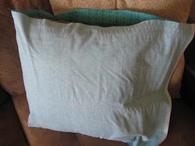
Old couch pillow:


Fun Fabric:


Here’s a shot up close so you can see the design:


First I measured the length of the pillow, from one seam to the other side.

Then I measured where I wanted my sewing to go on the fabric:


And I sewed it inside out, because that’s how you sew things, of course:


I’ve only used a sewing machine like 3 times in my life. I know. Can you believe it? But it’s true. And my friend was here to help me thread it and get it all ready for me, so I was able to start it and I was pretty successful for the first few lines of sewing. But I did get a bunch of up thread at one point:


But I just turned the corner and just kept going anyway, and it worked out okay:


I don’t have any pictures of the big fiasco I had in my pillow cover sewing adventure. This was after I
took the bobbin out to check to see if I was getting low on thread in the bobbin, which I wasn’t, so I put
it back in. When I continued sewing the upper thread kept breaking. I tried to call my friend, but she was busy at work, and I called my husband (the seamster in our marriage) and we tried to troubleshoot it for a while, with no luck. So I went online to see if there were any video tutorials for setting up a sewing machine. And it turns out, I didn’t know that the bobbin had to click and set. I was just placing it in the bobbin area without pushing it in and making sure it clicked. Boy, do I feel lame.

So once that was properly set I finished with flying colors. I sewed three sides (plus a tiny bit by the
corners on the 4th side) and then I put it around the pillow to make sure it was going to fit:


It fit perfectly, so I went back to the sewing machine to sew the 4th side and I realized that I’m too
lazy, so I simply covered the pillow and tucked in the extra fabric! Walla! No one will ever know the
difference!


Plus, if I ever wanted to wash the cover it would be easy to take it off the pillow, wash it, and put it back on.

Here’s a close up of the finished product:


I’m pretty proud of myself because my pillows turned out quite well. I covered two pillows with that
fabric. My husband came home and inspected my work and he said I did a good job. Yay me!

So, now that I know how the bobbin works I won’t be so afraid to sew next time. What do you think of
the pillows? The pretty fabric really makes the room feel more fun and less drab than it did before.

I want to thank Maria for allowing me to steal her blog for the day. You all can come and visit us any time at 1house1couple!

***
Love this tutorial, thanks so much for sharing with us today, Lisha!  Now head on over to her blog and check it out!  :-)  Have a safe day and evening, lovies!   I will catch you back here tomorrow.  ;-)

love, maria